Wednesday, December 30, 2020

Keep Creating! Repurposing my Art During Bummer Days


I need to get some more varnish so I can finish a couple paintings. I could start a new one, but I think I have reached a point of wanting to get some varnished, off my easels and stands, and just finished. It is easy to get stuck in this process of not fully finished (at least for me), and prefer the work of creating the images, letting them pile up. So, until I get some more varnish, painting work is just on a pause. 

Honestly, I am also in a bit of a bummer mood. We had family missing over the holidays, who had passed away since last year. I wanted to skip Christmas. Now I understand this must be a thing, at least for some people. This year it was more acceptable to do small Christmas because of the virus. Anyway, what is the word... Not lazy. But something like low inertia. Not much drive to paint. Painting is joyful for me. If I am in a very bad mood, for some reason I have a hard time crossing my own threshold out at times, where I am punishing myself for unknown reasons, and I do not dare deal with feeling better. Maybe it means all kinds of expectations of myself will flood back in, whereas I shut them all out where in a bummer mood. A little shut down. Okay, too much information, but who has not felt crappy. Especially during holidays when close family is gone. It makes me pretty crabby. But I have been creating some anyway, so here is some about that... 

Years ago I had some patterns/designs, prints for sale on a textile site (not sewing patterns, but I think of print design as geometric “pattern”). This was a fun experiment but not a money maker. I felt I needed to order a swatch of anything before listing. Some prints did not translate well to the cotton swatch, so it was good to sample first. Well I spent a little money on many swatches and probably the swatches didn’t even pay for themselves with everything I listed. But I was not able to control the print too much. And my original graphics were quite “busy”. I have problems getting caught up in the curiosity and fun of creating patterns and sometimes lack perspective, or ability to step back and consider if it makes any sense at all for a textile. 

Recently I have been playing around with a couple apps and could test out some prints on virtual objects. The prints are created from small images within my paintings. I have very many prints and objects now, but I am not very smart about file sizes or how any of it would translate. Again, if I wanted to print any of them, I’d have to order samples first. Many of my designs translate better to something like artisanal gift wrap. Others... tile or antique- modern linoleum print. In my imagination.

So from my place of crummy mood and lack of inertia, I have been inventing virtual things, repurposing my own art. If I went into a “mood” app, probably I am less “meh” or disappointed or sad, and more “okay” and curious, even if equally lazy. It is a tiny mood shift. Because I am not just watching YouTube videos (nothing against good videos), but I am creating. I am analyzing little segments, shapes, colors, and happy when I find a wonderful element or pattern buried within a basically boring line. 

Virtual purse created with one of my print designs:


Sunday, December 27, 2020

Author/Book Recommendation


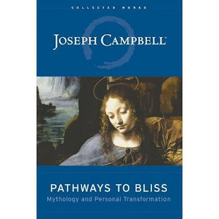
One of my favorite authors is Joseph Campbell. He writes in a slightly meandering way, philosophical, spiritual, imaginative, connected somewhat to cultural anthropology and Jungian thought or archetypes. He is clever and has a very strong voice that is easy to follow. His writing is fairly deep and yet, if you are a deep or spiritual thinker, it does not come across as incredibly heavy. I often laugh at his writing because he does write with a very good sense of humor.

“The Hero’s Journey” is perhaps his most famous work, connected to the inspiration behind the Star Wars trilogy. But my favorite book is “Pathways to Bliss.” For me this book offers much inspiring imagery and language, or a way to rattle your imagination a little if you need to dust it off and find new perspective. It is just very enjoyable to read. He is also very encouraging of the creative journey and reminds us of its importance, and also that it is quite imperfect and humorous at times, yet tangible. Don’t make a big issue of it and give up.


Wednesday, December 23, 2020

Color Palettes with Images


These two palettes are pretty different, referring to a maple bud in spring. The top one is a little cooler and brighter, while the bottom one is warmer and more muted. But both use soft light blue from the sky and some reds from the maple tree bud. The lower one has browns taken from small twigs or the bud itself; young or new growth little branches. 

These two palettes are pretty similar, so the colors are basically interchangeable. But overall, the top palette is an example of taking delicate images and colors from nature and creating a soft yet slightly striking palette. It is a little bit more bold, with the black and brighter turquoise. The second palette probably represents the image better, overall, and is a more muted palette. 


A couple palettes taken from one of my original paintings. I wrote about this one in another post, but had different palettes. These are two different palettes, possibly a little bit  interchangeable, but the bottom one is more muted and offers more contrast. Dark brown like a walnut color, or any cool brown, would offer contrast to the top palette. That just wasn’t available within my painting. 

Tuesday, December 22, 2020

Color Palettes from Nature

Color palettes taken from nature photographs I have taken. The nest one is on my Etsy site (at the time I am writing this post). 


Color Palettes from Original Paintings

Two palettes created by extracting some colors from a couple of my oil paintings. The one on bottom is mostly a red painting, with quite a bit of yellow. So the palette is not meant to represent a similar balance. The top one is from a painting that has quite a bit more red and magenta than you see in this palette collage. It is one of my favorite paintings. 


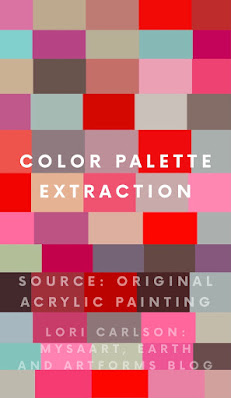
This palette, from acrylic painting, came from the painting below. So you can see kind of how I did this or what one of these refers to. I start with not a very large palette when creating an abstract painting. Many new tones are created in the blending of the original palette I choose; this is how the whole new painting or palette becomes richer. To me, this is intensified with oil paints because of the slow drying and the rich way they blend. But I paint very thick with acrylics (little water), and do not intentionally mix any colors within my palette. They blend minimally on the canvas. 


The middle painting is the origination of the palette directly above. This is available as a small print download on my Etsy site: MysaArt. I am blogging from my phone and having a problem linking right now. If interested in any prints or seeing a few more (not so many listed as of right now), I do have my store linked in the side bar. 

The other two paintings were similar in style, though quite different from one above, because I formed them from lines vs just blobs of color. But they are also, in the end, essentially blobs of bright color in oil pigment. This painting I posted here is a small acrylic painting I made. I prefer oil paints but they are a little more tedious and obviously require longer drying. Humidity is sometimes an issue in my house. So I have come to find ways to enjoy using acrylics a little too. This is not a style I create often, this painting above. But it is specifically something I created to highlight a preferred red. 

Color Palettes from Stained Glass

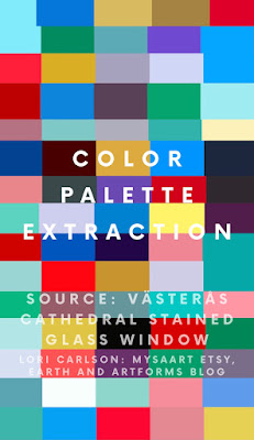
 Descriptions are found on the image. I have been to Chartres, but admit I borrowed this image online. The image used for the palette from a window in Västerås Cathedral is a photograph I took. Both are beautiful windows but the windows of Chartres are famous for their cobalt blue. The relatively limited palette and focus on the blue with red highlight, creates very pretty and memorable windows in Chartres. 


Color Palettes from Sweden

Here are a few color palettes I extracted from photographs I took in Sweden. The first one was a photo of a several strands of yarn, samples of dyes. The second one comes from a few photos taken at the Dala horse shops, which are connected to the factory. The most famous color for the Dala horse is red, but they have almost as many white, black, yellow, and many blue in a few shades, some purple, and a couple other colors. Also included a little in the palette are some of the colors from the kurbits painting design on the horses, which is pretty delicate, not apparent on a wide view, but part of a color scheme when looking closely at a row of horses to choose your favorite.

The palette from the interior of a rural church has very classic colors, I think. The gold and bronze type colors in here are mostly from fixtures and ornaments, chandeliers and gold leaf. These are found even in small rural churches and I would say in a small church these colors became an obvious part of the overall palette. Very pretty with the kind of antique sky blue and very dusty kind of light blush tones. 


Keep Creating! Repurposing my Art During Bummer Days

  I need to get some more varnish so I can finish a couple paintings. I could start a new one, but I think I have reached a point of wanting...